How to Install Lightroom Presets on Mobile
Import a DNG preset once and reuse it on every photo, the exact taps, in order.

Three things, in order of importance: separated colour in shadows and highlights, controlled contrast that keeps detail at both ends, and a slightly soft texture. Films rarely look sharp and saturated, they look graded.
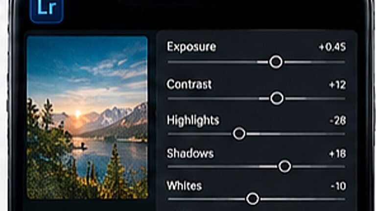
Lift the black point a little and pull the top of the curve down. This flattens the extremes, which is what gives film its rolled-off look on a phone screen.
Push shadows toward teal or blue and highlights toward a warm amber. Keep saturation under 25 on both, the effect should be felt, not seen.
In colour mix, nudge orange saturation down slightly and luminance up. This is the step most people skip, and it is the difference between a cinematic photo and an orange face.
Tip. Zoom to 100% on the face before and after. If skin shifted hue, back off the orange channel.
Add grain around 12 to 18 with a small size and pull texture slightly negative. On a phone screen this reads as film stock rather than noise.
Import a DNG preset once and reuse it on every photo, the exact taps, in order.
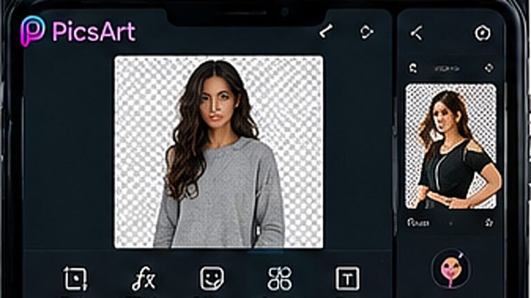
Clean cutouts around hair and edges, using the free tools only.
A repeatable five-step routine that keeps a feed looking like one person made it.