Free vs Paid Lightroom Presets: What Actually Differs
Most paid packs sell organisation and variety, not magic. Here is how to tell a good free preset from a bad one.

A consistent feed is not a talent thing, it is a rules thing. The accounts that look designed have quietly narrowed their choices: the same light, the same grade, the same crop. Here is the smallest set of rules that gets you there.
Most inconsistency is lighting, not editing. Decide that you shoot in open shade and in the hour before sunset, and simply do not post anything shot under hard midday sun or mixed indoor light. Two conditions gives you variety without chaos, because your edits start from a similar place every time.
Pick a single preset as your base for a month. When a photo needs more than exposure and white balance to fit, that is information about your shooting, not a reason to switch looks. Swapping grades per post is the fastest way to a messy grid.
Tip. Keep the previous month base preset saved. Feeds read as consistent across a scroll of nine, not across a year.
Choose 4:5 portrait or 1:1 square and stay there. Mixing ratios changes the rhythm of the grid and makes carefully matched colours feel unrelated. Shoot a little wider than you need so you can crop to your ratio without losing the subject.
Open your profile and look at the last nine posts together. That is where people actually see your work. If two images fight, the fix is usually sequencing, moving a busy photo away from another busy photo, rather than re-editing either one.
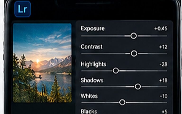
Consistency survives busy weeks only if the routine is short. Crop, exposure, grade, small adjustment, export at full size. Doing those in the same order every time removes most decisions, which is the entire point.
One base preset for a month, with small manual adjustments per photo. Two at most if you post both portraits and flat-lay product shots.
Yes. Export at the largest size your app offers and let Instagram compress once. Screenshotting or re-saving an already compressed file is what creates blocky skies and mushy detail.
No, match the mood, not the numbers. Aim for a similar tonal range across nine posts; identical exposure on every image makes a feed look flat.
Most paid packs sell organisation and variety, not magic. Here is how to tell a good free preset from a bad one.
One is a colour tool, the other is a composition tool. Using both is the point.
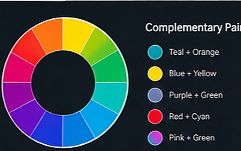
Why teal and orange works, and three other pairs that do the same job differently.