Free vs Paid Lightroom Presets: What Actually Differs
Most paid packs sell organisation and variety, not magic. Here is how to tell a good free preset from a bad one.
You do not need the vocabulary to use the ideas. Colour grading is mostly one move repeated: push shadows one way, highlights the opposite way, and leave skin alone. Here is why that works and what your options are beyond the obvious pair.
Human eyes read depth from colour difference. When shadows sit cool and highlights sit warm, the frame separates into layers and feels three-dimensional. That is the whole trick behind most cinematic grades: not saturation, separation.
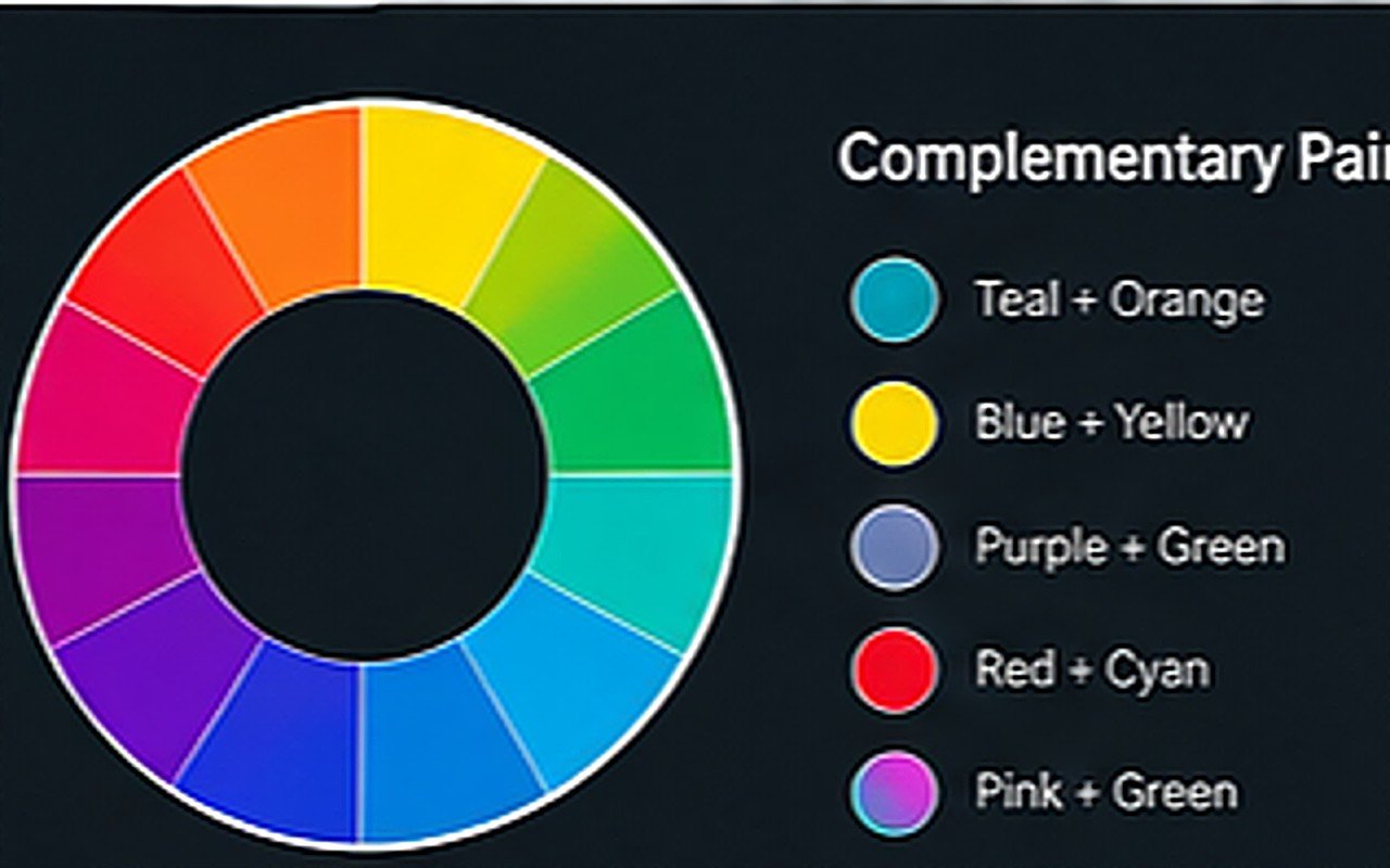
Skin is orange. Put anything near teal behind it and the subject pops, because teal is roughly opposite orange on the wheel. It became a cliche because it works on the most common subject in the world, people.
Opposites are not limited to one pair. Each of these gives the same separation with a different emotional read, and all three are less used, which makes your work look less templated.
Every grade eventually lands on someone face. In the colour mix panel, pull orange saturation down slightly and orange luminance up. This single step is the difference between a graded portrait and a sunburnt one.
Tip. Zoom to 100% on a face before and after grading. If the hue shifted, back off the orange channel, not the whole grade.
Look away from the screen for ten seconds, then look back. If the colour is the first thing you notice instead of the subject, you have gone too far. Good grading is almost invisible until you see the original next to it.
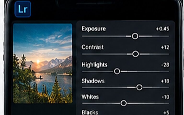
Applying one colour to the shadows and a different colour to the highlights. In current Lightroom versions it lives under Colour Grading, with separate wheels for shadows, midtones and highlights.
Vibrance, mostly. It protects already-saturated colours, including skin, while lifting the muted ones. Saturation raises everything equally and is the usual cause of orange faces.
Choose one opposite pair and stay with it across photos, thumbnails and type. Consistency reads as identity far more than any specific colour choice.
Most paid packs sell organisation and variety, not magic. Here is how to tell a good free preset from a bad one.
Pick two light conditions, one grade and one crop rule. That is most of it.
One is a colour tool, the other is a composition tool. Using both is the point.