Free vs Paid Lightroom Presets: What Actually Differs
Most paid packs sell organisation and variety, not magic. Here is how to tell a good free preset from a bad one.
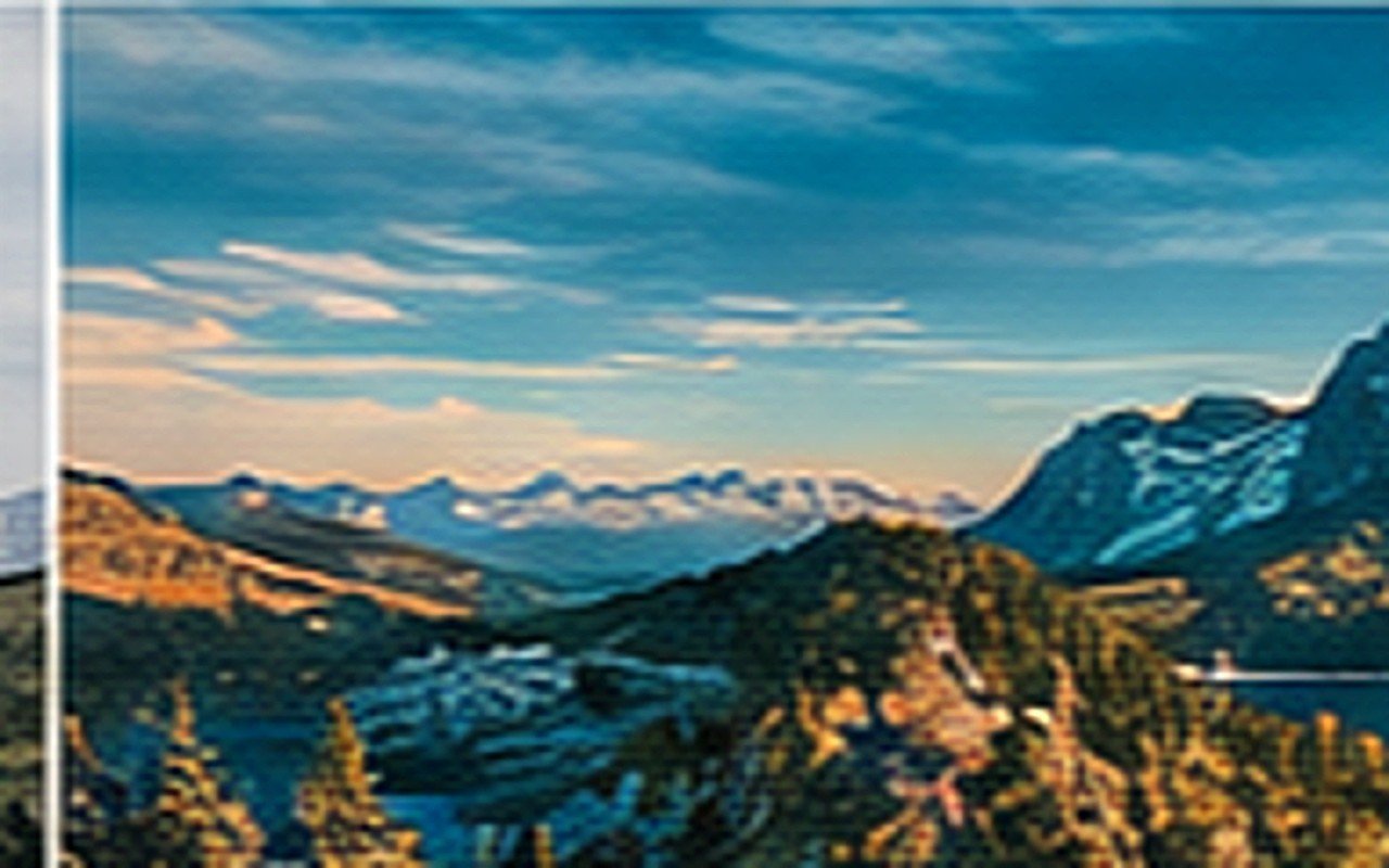
Your phone is doing a lot of work to keep every part of the photo visible: brightening shadows, pulling highlights down, merging frames. The result is technically correct and visually dead. Rebuilding depth by hand takes about ninety seconds.
Multi-frame HDR exposes for the shadows and the highlights at once, then blends them. Nothing in the image is dark, so nothing is bright by comparison, and contrast is comparison. That is the flatness you are seeing, and it is a processing choice, not a lens limitation.
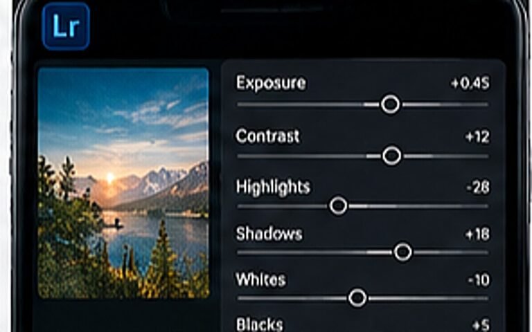
Set the black point before anything else. Pull blacks down until the darkest part of the frame actually looks dark, then lift exposure slightly to compensate. This single pair of moves recovers most of the depth your phone removed.
Tip. If the photo starts looking noisy in the shadows, you have pulled blacks too far for that source file.
Clarity and structure are tempting and they make phone photos look crunchy and over-processed. Use the tone curve instead: a gentle S-shape adds contrast where the eye reads it, in the midtones, while leaving texture alone.
Flat files usually have flat colour too. Drop the saturation of the two colours competing with your subject and raise vibrance slightly. Selective beats global every time, and this is the step that separates an edited photo from a filtered one.
The real fix happens at capture. Tap to focus, drag the exposure slider down about a third, and use RAW or Pro mode if your phone has one. A slightly dark RAW file gives you everything you need; a bright HDR JPG has already thrown it away.
Leave it on auto for everyday snaps, but switch to RAW or Pro mode when you intend to edit. Forced HDR is the setting worth avoiding.
Yes, mainly in the shadows and in white balance. RAW keeps far more data to push around, which is exactly what rebuilding contrast needs.
Platform compression struggles with heavy clarity, noise and strong gradients. Keep clarity low, export at full resolution, and upload the original file rather than a screenshot.
Most paid packs sell organisation and variety, not magic. Here is how to tell a good free preset from a bad one.
Pick two light conditions, one grade and one crop rule. That is most of it.
One is a colour tool, the other is a composition tool. Using both is the point.